ManageWP.org was just officially launched few days ago and I’m pretty sure many WordPress users are very excited to hear about this news. ManageWP.org is owned and operated by the same person behind ManageWP.com (Note the difference in domain extensions: .com vs .org). Finally, after 6 months of design and development, the site is ready to kickoff.
I’m excited with what I’ve seen so far. For example, there are lots of new websites that write about WordPress I’ve never came across before. With more and more WordPress users joining the site, looks like this site will grow as a place for WordPress community to share latest news and tutorials about WordPress.
Behind the Scene of ManageWP.org
If you’d love to hear the story behind the making of the site, you should read this article on ManageWP.com - Introducing ManageWP.org: The People-Powered WordPress Community.
Pretty much, they focused on every aspects of the site such as design, user experience and technology behind the site to make sure the site will run fast and be a great place for the WordPress community.

What’s Great About ManageWP.org
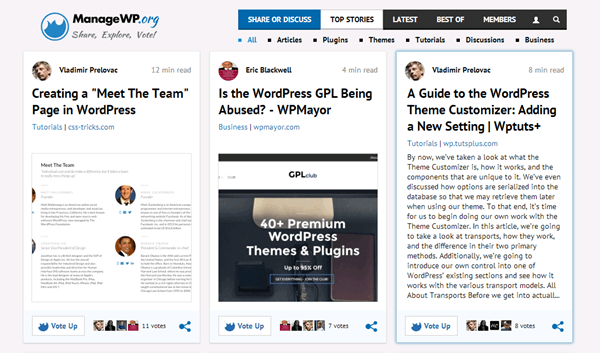
1. Great design - ManageWP.org comes with great and modern design. Good to know that they’re also responsive, so the site will look great on any device. The main layout looks like Pinterest site which is great to give more focus on the content.
2. Social login - ManageWP.org allows you to sign-up for an account using Twitter and Facebook. No more email verification. However, I’ll be glad to see an option to signup an account using email for those who don’t like to use their Facebook or Twitter account due to privacy reason.
3. Discussions section - I’m really excited to see this feature. Currently the’re not much discussions over there, but I’m sure as more people register with the site, there’ll be more discussions and excitement over there.
4. Social button - More like Digg and StumbleUpon, the developers did a great job on creating a ManageWP.org social button that can be placed on your site to make it easier for readers to vote or share your content on ManageWP.org. Please see the Resources page for more information about this.
5. Browser bookmarklet - Found any quality WordPress-related news and would like to share it with the ManageWP.org community? There’s a browser bookmarklet button to make sharing an article even easier.
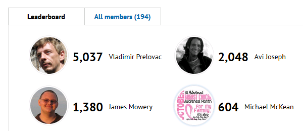
6. Voting system - As more people register with the site, we’ll see more and more articles submitted on the site. Therefore, I believe this voting system is good way to make sure great articles or tutorials get highlighted on the front page. Don’t worry, there is also an archives page for latest articles submitted on the site so you won’t miss latest news around the globe about WordPress.
7. Ads-free - I like the clean design, plus the site is currently ads-free, means no distraction to the content. However, I’m pretty sure they have their own plan to monetize the site in future.
Submitting an Article at ManageWP.org
Submitting an article is really easy, probably will take less than 10 seconds!
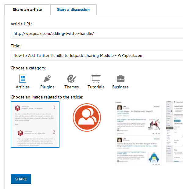
First, grab the link of the article you’d like to submit. Then, click on the Share link on the menu. It’s colored in blue and is so obvious so you’ll never miss it.

Next, put the link of the article in the Article URL field. In about 2 seconds, it’ll grab the post title and any related image for the article. Then, you’ve to choose the right category and thumbnail for the article. Once done, simply hit the the Share button.

The Confusion Between ManageWP.org and ManageWP.com
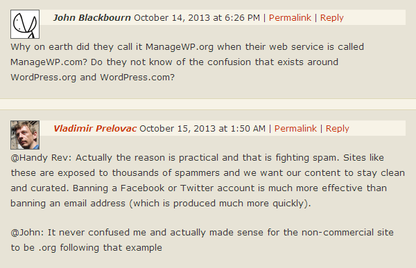
I don’t remember how many times I’ve to explain to other people the confusion between WordPress.com and WordPress.org. While writing this article, I decided to write ManageWP.org as ManageWP.org instead of just ManageWP so people won’t get confused with ManageWP.com.
I’m sure it’s not just me dislike this, as some other people had pointed out the same issue on WPTavern:

Suggestion for Improvement
Although I like the design, I must say the UX of the menus could be improved. When I first use the site, I’m quite confuse of how the menus work. Take a look at these two links as an example:
Latest > Tutorials (http://managewp.org/articles/tutorials/latest)
Greatest > Tutorials (http://managewp.org/articles/tutorials/bestof)

At a glance, you’ll never notice that the Tutorial submenu exists for both Latest and Greatest menus. I believe that most of the readers will agree with me - they’ll think that the Tutorial submenu is just a one similar page.
Secondly, I’d love to see better way to manage the Discussion section - probably with the use of tags to categorize the topics of discussion for better navigation.
ManageWP.org site was just opened to the public and I’m happy to see the site grows and become a great platform for all WordPress users to get high quality content about WordPress from around the world.
A very nice and helpful initiative indeed.
The only downside to me is the lack of full articles in the RSS feed. I read the internet through Feedly on a tablet and switching back and forth between websites and the reader is not really speeding things up.
Would be a great feature.
Yes, ManageWP.org is more like an aggregator site, a place for people to promote their article. Therefore, it’s not possible to read the full content of each article on the site.
Thanks for the heads up on this, looks like it will become a very useful resource!
Nemanja says
Nemanja from ManageWP here, thanks for covering ManageWP.org!
I appreciate the UX suggestion, you raise a valid point. Can’t say if and when we will get on top of this since ManageWP.org is a project we work on in our spare time, something that’s in short supply