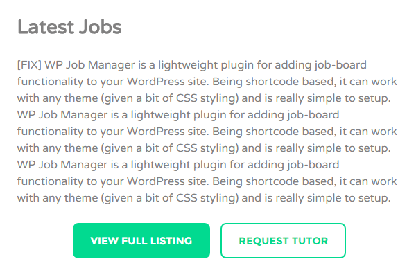
In today’s tutorial, I’d to show to a little hack to force button to be at the center of the page. This was one of the little things I’ve to do for one of the recent projects for my client. Here’s the final result:

First, to add a button, all you need is a line of HTML code like this:
| 1 |
|
Then, to place two buttons side-by-side as shown above, you can re-use the HTML code above twice:
| 1 |
|
Here’s the trick. To force the button to be at the center using text-align: center on the .button class simply won’t work. To force the button to be at the center,you need to wrap the HTML code inside a div . In this example, I’m wrapping the code inside .button-center:
| 1 2 3 4 |
|
| 1 |
|
| 1 2 3 |
|
| 1 |
|
Next, simply add text-align: center; property to your newly created class. You may copy the code below and paste in your theme stylesheet file (style.css):
| 1 2 3 |
|
Things to note:
1. The design of your button(s) might be diffent depending on your theme design.
2. In the HTML codes above, please change the hashtag (#) with your URL.
3. .button and .button-right are the CSS classes that belong to the theme I’m using. Yours might be different. But you can always use Firebug to inspect what class your theme is using for button.
This trick works perfectly for me. If you’ve another way of doing it (perhaps a better way), do let me know in the comment below!
Leave a Reply