Early this week, I saw a tweet from Mark Jaquith, one of the core developers for WordPress about the upcoming Twenty Thirteen theme. He also wrote an article about it - Introducing Twenty Thirteen. By the way, here’s the tweet that I said earlier:
Early peek at the default theme we’re working on for WordPress 3.6… “Twenty Thirteen”: twentythirteendemo.wordpress.com Emphasis on post formats.
— Mark Jaquith (@markjaquith) 19 Februari 2013
If you’re wondering how did I embed the tweet on my article, previously I’ve written a tutorial about it - Embedding Twitter Tweet in WordPress.

Default header for the Twenty Thirteen theme.
Here is the link for the demo site for Twenty Thirteen theme.
Twenty Thirteen will come with upcoming WordPress 3.6 which will be focusing on Editorial Flow, Auto Save, Post Formats and few other areas that need improvement. You might want to read the official post about the upcoming WordPress 3.6 - What’s Coming Up With WordPress 3.6.
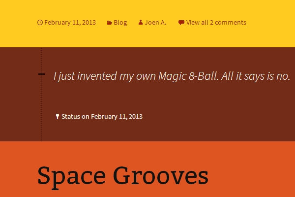
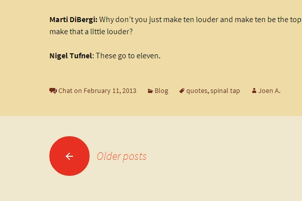
As you can see from the demo page, Twenty Thirteen focuses on Post Format. Each Post Format has different color. In WordPress 3.6, you can also expect a better UI for Post Format.

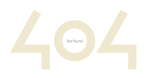
404 Error Page on Twenty Thirteen theme.
That’s the 404 Error page for the theme. Much better than any previous themes, and not to forget the awesome typography too. If you’re using Genesis Framework, previously I’ve written an article on customizing the 404 page - Creating a Custom 404 Page in Genesis.
Here’s some sneak peek for the theme:


As the time of writing, the theme isn’t officially available for download. However, if want to be among the first ones to download it, read the article on WP.Tutplus - Quick Tip: How to Install Twenty Thirteen on Your WordPress Site.
[…] are some sneak peeks of this upcoming Twenty Fourteen […]